Pages

Monday 20 December 2010

Audience Research: Interview


As part of my audience research task, I chose to record opinions, from a few of my peers, onto a dictaphone. The interview was based around a few questions that I felt was important. Below you can find subtitles to the audio if you are unable to hear the interview properly:


Q1) If you heard of a Hip Hop and R’n’B magazine called "Sound Wave" how would feel and what kind of thoughts come to mind when you first hear it?

Um... I think it's pretty boring as, umm-um… I mean as like you’re aiming you're magazine to younger kids and i think your title should be something more modern.

It’s my belief that Sound Wave sounds a bit technical for someone who doesn’t  like listening to music BUT it could be a fresher approach to R’n’B and Pop BUT if you’re gonn-, would I buy the magazine, I'm not sure BUT it sounds pretty fresh to me.

Umm the word Sound Wave, yeah, it reminds me of my physics lesson, yeah, which is not appealing, yeah, so therefore I wouldn’t buy your magazine.

Q2) What would you look for in a Hip Hop and R’n’B magazine?

Well firstly I would obviously like photos, pictures of the, like, the most popular celebrities and maybe some interviews from them, and their latest albums.

Umm yeah (same as her) but I would look for, like, reviews of different music that has just come out, pictures and, umm, interviews. What about things like upcomin-? Yeah, up and coming artists, yeah, i would look for that as well.

Umm, I'd look for artists on the front cover that have big chains and their caps with flashy clothing and yeah their upcoming songs or the best track of the month. Oh so you would prefer a more, umm, modern flashy symbols like you said flashy chains and things like that? Yeah that represents Hip Hop, that’s why.

Q3) Would you prefer an interview as the first page article? If yes, why?

Not really sure but when I open the magazine I usually expect the interview to be, like, in the middle but if it was on the front [don’t you mean first?] I wouldn’t mind it but it would have to be of a very good quality.

Interview yeah, eguh [?] I would like it at the front because if it’s about your favourite artist then it woul- it needs to catch your eye therefore I'd want me to buy the magazine.

Q4) Do you think the magazine needs a website; do you feel that it is a necessity?

Well because of the online age expanding and growing every day, I think it is possible that your magazine may need a website because certain members of the public may not like going over to the shop to buy a magazine and they would probably prefer to view it online.

Yes online would be better because wha-huh- if you, if you produce hard copies that would waste more paper and if you waste more paper and, you know, it'd be bad for the trees so you'll be eco-friendly that way.

Sunday 19 December 2010

Questionnaire Analysis For Target Audience

Questionnaire Analysis for Target Audience


After collecting information from my peers, I extracted data found in the questionnaire and analyzed the results. I created some graphs (above) based on the important information that I needed...


From the questionnaire, I gathered the most important information and I reckon that I should base my target audience around the results:

  • Slight majority of the sample were male but slight minority of the sample were female
  • Most of the sample were young people, preferably teenagers, between ages 14-19
  • Most of the sample preferred to listen to R'n'B, Hip Hop/RAP and Heavy Metal
  • Most of the sample generally buy magazines
  • The majority would want to read the magazine online

Saturday 18 December 2010

My Questionnaire: Searching For My Target Audience

Questionnaire for Music Magazine


This is an electronic copy of my questionnaire that I used to gather a possible audience profile. Before creating this questionnaire I had to consider what my questions should be based on. I also thought about the length and wording of my questionnaire. Usually if a questionnaire is too long and complicated then most people would avoid completing the questionnaire. A similar thing could happen, if the wording of the questionnaire is too long or not understandable.
Before creating my own questionnaire, I completed a few questionnaires that belonged to my peers. One of the most significant questionnaires had very few options and I ended up filling a lot of the "Please specify" sections of the question. I found this tiring and unnecessary. I felt like giving up and handing in the questionnaire incomplete. I thought that this was worth taking into account when creating my questionnaire.

Friday 17 December 2010

Double Page Spread Analysis 2: NME

**Please note, the text on this image is almost unreadable due to being a low resolution image. This analysis will, therefore, be shorter and inaccurate because of this reason**
  • From the text on this page we can tell that the band are called the Teenagers.
  • The room, in which they are sitting in, is very messy. Perhaps they are trying to link the name of the band to the state of a teenager's room.
  • The band look very relaxed and chilled out.
  • The page uses the colour blue, which is normally associated with men.
  • The blue also highlights the most important parts of the page.
  • There is a small notepad on the bottom left hand side of the page with the words "Need to know: the Teenagers". On this notepad, there is short information on what readers need to know about this new band.
  • We can tell that the article belongs to an NME issue as there is a button above the title which says "NME loves". In addition, we can see the NME website logo at the bottom of the page.
  • The page has a pull quote "Of course we're a sexual band. We're the Teenagers and that's all they think about".
  • Colloquial terms like "dumb" are used. This gives the page a informal, conversational tone as most people would use colloquial terms while they talk to their friends.
  • The key image is placed on the left, consuming the whole left hand side of the double page spread. Little text is used on the left. Most of the article text is placed on the right hand side.
  • There is some non-article related text and images on the right hand side. Indie artist names are taken: Asobi Seksu, Crystal Castles and the Rascals.
  • The band are looking directly at the camera: a direct mode of address is used.
  • The beginning of the article uses a drop cap, which is conventional for double page spreads.
  • Other colours that the spread uses are black and white. This gives the spread a newspaper like feel. This is accompanied by the column layout of the text.
  • The band are wearing very casual clothes, something that teenagers would wear.
  • There are many posters on the wall in which the band are sitting in. This could show that teenagers are very messy people.
  • The band look like stereotypical teenagers with their casual clothes and messy hair. We can see several representations of teenage boys shown here: the one in the middle looks like a nerdy teen, the one on the right represents teens that grow their hair to long lengths and the one on the left looks like the typical good looking, popular teen.
  • The word "sexual", which is found in the pull quote, relates to teenage life. Teenagers are often curious and attracted to sex and this quote suggests that this article and the band's music are aimed at teenagers.
  • Overall the page has a lot of teenage connoted symbols and language. However the layout of the article itself is very neat and tidy. The words are well placed with the exception of the left had page, where the text is put anywhere.

Thursday 16 December 2010

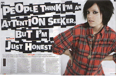
Double Page Spread Analysis 1: NME

  • The main image on this page is that of the famous British music artist Lily Allen
  • Allen wears casual attire: the article is about the writer visiting her home.
  • The title could be a floating quote that is taken from the article. The article is longer than 2 pages.
  • From the title, we can tell that Lily Allen is a very straight forward person as she states her opinion: "People think I'm an attention seeker, but I'm just honest" sounds very personal and powerful, it sounds like something from a conversation. The tone is direct.
  • The main article uses colloquialism by using words like "fucking" and "hootenanny". 
  • The word "fucking" is used twice in the article which gives the word emphasis and perhaps expresses the feelings of the article writer: swear words are often used in times of frustration and anger.
  • The article also uses intertextuality three times: once when it refers to a '70s BBC comedy program, "Some Mothers Do 'Ave 'Em ", the second time when Allen's album, "It's Not Me, It's You " and a mention of another album, "Alright, Still ". Intertextuality could be used to catch the reader's attention.
  • A drop cap is used: this is a very common convention of double page articles/spread and is used in most if not all double page spreads.
  • Other conventions are seen like the pull quote that has been taken from the other unseen half of the article. Page numbers can be seen at the bottom along with the magazine name (NME) and the issue date of the magazine
  • Credit has been given to the person who created the idea of making the title look like letters cut out from a newspaper.
  • The style of the title suggests that perhaps Allen has something to hide or that she lives behind a mask: newspaper cut out words are often associated ransom notes which masks the identity of criminals when handwritten notes can easily identify criminals. Allen is portrayed as a criminal.
  • The colours used correspond to the clothes that Allen uses as well as the magazines colours: red, black and white.
  • Allen looks like she consumes the whole page and the title does the same, leaving little space for the main text.
  • This article is a personal account of the writer, as they visit Allen's home
  • Allen is represented as a stereotypical young person. We can see this by the hairstyle. However she is not represented as a stereotypical woman. She wears a shirt instead of a t-shirt or a skirt.
  • Allen's pose makes it look like she is listening in on a conversation. Perhaps she is suggesting that the readers should also read carefully.
  • Allen is used both on the front cover and this double page spread. She is this issue's focus.
  • The main text is laid out in columns, giving it a newspaper appeal. It could suggest that this article is important as the newspaper appeal makes it seem like important news.
  • The spread uses a direct mode of address: the tone is direct and Allen is looking directly at the reader (direct mode of address)
  • This article is probably aimed at younger people. You can tell this by the clothes Allen wears, the newspaper cut out font used as the title and the colloquialisms used in the article. But the newspaper appeal makes it seem like it is aimed for older people. Perhaps the target audience is late teens to late 20 year olds.

Wednesday 15 December 2010

Contents Page Analysis 2: Q


  • We can identify the magazine name because of the logo which is located in the top left corner of the page and towards the bottom of the page.
  • 'Q' specialise in the music genres Rock and Britpop
  • They have used a 'Features', 'Reviews' and 'Special' section on the magazine. These are the usual conventions of a contents page.
  • The issuse number and date have been placed at the top of the page.
  • We can see that Q have their own website and MySpace page. Q are moving in with modern days and moving away from the traditional boudaries of giving information to readers.
  • The main image does not take up as much space on the page as the other covers (Vibe and NME) do. This allows the magazine desginers to put in more information.
  • The main image is that of the band Oasis, the famous rock band.
  • They are standing in the countryside: this is in contrast to the music genre that they are usually linked to (Rock).
  •  However they also do make Britpop music. When people think of Britian, they link it to the countryside
  • We can tell that this particular issue is about Oasis: we can tell this from the key image and the 'Oasis Special' that is found in the issue.
  • Band member names are taken often: Liam Gallagher and Noel Gallagher. Liam and Noel are the original band members but now the band are now dispersed. This article could become the USP (unique selling point) of this particular issue.
  • Other rock artist names are also taken: Kings of Leon, Kaiser Chiefs, Glasvegas, The Streets, The Chemical Brothers, My Bloody Valentine and The Coral
  • Other typical features that this magazine uses are things like a crossword, album review and an "essential tracks" article.
  • I have identified a tie-in: a subscription service page
  • The page uses a color scheme that can be used to identify the magazine brand. Red, white and black are used, which is seen on many Q contents pages.
  • Other colors are used in the minorty: gold and grey
  • Gold is used in the 'Oasis Special' section, perhaps the page is highlighting the fact that it is the main feature of the magazine.
  • The band is wearing simple, casual clothes. This could indicate that the band see themselves as normal people.

Tuesday 14 December 2010

Contents Page Analysis 1: Vibe

  • A black-to-white gradient runs from the top to the page and down to the bottom. By using a gradient, there is a calm, serene appeal from the page.
  • Ciara, the model, is a popular R'n'B artist
  • The page is not filled with text: too much text usually puts of the reader.
  • Ciara, the key image, consumes most of the page. All the attention is directed onto her.
  • Ciara is lying down with her legs high up in the air. It seems like she is bordering the text on the right from the other items on the page.
  • She wears short clothing, showing her bare legs: she seems like she is seducing the reader of the magazine. She is wearing very modern clothing. She is wearing makeup and high heels. Perhaps this particular issue aims at a young female audience
  • Her posing makes the page look very unique unlike contents pages from other magazines like NME, who follows a consistent, organized layout.
  • The page does not follow an organized layout however the page does not look droopy or messy but tidiness has been taken into account.
  • This scattering of the word "contents" is something Vibe always do: it has become something of a motif.
  • Very simplistic design and colour choice, too much colour can also put off the reader because it may have a bit of a flashy appeal. After all, this is not a children's magazine.
  • Using black and white gives the page a classy and serious look. The white text stands out.
  • We can tell that the magazine also talks about fashion; indicated by one of the sections: fashion is usually associated with females which, again, indicates the target audience
  • Females can associate themselves with the model and her appearance.
  • We can see that the theory, 'to-be-looked-at-ness', is used here. This theory was thought up by Laura Mulvey in 1975. This theory stated that women in media texts are used as visual pleasure.
  • Ciara's legs form a 'V' shape, which is linked to the magazine name.

Monday 13 December 2010

Front Cover Analysis 3: XXL

**Please note: It is generally harder to find a Hip Hop/R'n'B magazine with a female artist on the front cover**

On this cover of a Vibe magazine, we can see that the key image is that of famous Janet Jackson, sister to Michael Jackson.

  • Janet Jackson is posing as if she is about to take a photo: she may been seen as eye-candy
  • The cover uses mainly sky blue, light peach and black
  • The model is clearly identified by the text on the right side of Janet Jackson
  • Her presence on the cover suggests that there are female R'n'B/Hip Hop artists that exist.
  • The word 'watch' is reinforced by the camera
  • Janet and the camera are both using a direct mode of address.
  • She poses as if she is taking a photo of herself: she is aware of her body language
  • She is positioned in the centre of the cover and a medium close-up is used to show most of her body
  • She is posed provocatively as she wears a short tight vest and has a finger under her jeans. Perhaps Janet Jackson is seen as a sex symbol.
  • She has very stylish hair: modern look
  • Low lit colours surrounding Janet makes her seem as if she is popping out of the cover
  • Other artists names are taken: Mario, Rihanna, Dr.Dre and TuPac.
  • Colloquial language is also used like "luv's", "lo" and "shawty". It suggests that the magazine aims at the younger generation
  • Alliteration is also used: "sensual seduction". More sex symbolisms.
  • Cover lines are separated across the page: A single cover line, "Janet Jackson likes to watch" is found by itself away from the other sell lines suggesting that she is of high importance
  • Vibe could be specializing in gossip as we can see sell lines like "Rihanna- Exposed" and "He's free, but is he good? The untold story of Busta Rhymes".
  • The cover uses the word "Paparazzi" which is ironic as this particular issue seems to attack Rihanna and Busta Rhymes
  • Vibe also talks about gaming as well. We can tell this by the cover line "15 crucial video games"
  • The mast head identifies us of the magazine name: Vibe
  • Pink is normally associated with women

Sunday 12 December 2010

Front Cover Analysis 2: XXL

XXL is a Hip Hop magazine that is published by Harris Publications. They have to compete with other companies like Q and Vibe so that they can still stay in the business.


  • The well known Hip Hop artist Jay-Z is seen over towering a city with tall skyscrapers.
  • We can tell that this city is New York city because of the Empire State building seen in front of Jay-Z. 
  • Jay-Z is shown as a character that is larger than life as he towers over the city.
  • New York City because of the tall skyscrapers like the Empire State building.
  • The size and position of the key image (Jay-Z) tells us that he is superior and all the attention is drawn to him (putting him on the pedestal)
  • Suggests that New York City is the capital of Hip Hop
  • New York City is, ironically, Jay-Z's hometown
  • High contrast in colours makes Jay-Z stand out more
  • Jay-Z's name is larger than most of the text on the page, relating to the rhetorical question: "Is Jay-Z bigger than Hip Hop?"
  • Using a lot 'big' related words suggest that Hip Hop is a big or major genre
  • Other Hip Hop artists names are used (Eminem,Timbaland and Trey Songz) are used but are much smaller than size. Maybe this particular issue is mainly about Jay-Z?
  • This cover looks very unrealistic or surreal
  • The image of the New York City, especially the Empire State building, relates to Jay-Z's song "Empire State of Mind"

Saturday 11 December 2010

Front Cover Analysis 1: VIBE


Vibe is a music and entertainment magazine which was founded by the well known producer Quincy Jones. This magazine was shut down in the summer of 2009 but was relaunched after being purchased by private investment company, InterMedia Partners. Because of this, VIBE now has a larger online presence. They aim at predominately young followers of urban and hip hop culture. They compete with companies like the Source and XXL.


This magazine is aimed at young music lovers in particular. We can tell by looking at the sell lines that this particular issue of VIBE is aimed at rap lovers. The cell lines includes words like "Rap" and "Rapper" and names of well-known rappers like Eminem, Lil Wayne, T.I, Kanye West and Jay-Z. Other artist names are used in the sell line as well. One of the sell lines uses a direct mode of address, which asks the audience to decide on who the best rapper is. The sell lines are wrapped around the key image. The mast head consists of the skyline where we find the names of music artists, rappers in particular. We also see the magazine name, Vibe, which has the connotations of youth. It sounds like something that young people would say or use which suggests its target audience:young music lovers.


The key image of the magazine front cover is a medium close-up of the world-renowned R'n'B artist, Eminem. Eminem is directly looking at the reader, wearing a look of seriousness. His tough facial expression makes him look important. This is reinforced by the size of the image: it consumes a majority area of the page. Direct mode of address is a very powerful advertising technique as it makes the audience feel that they are just as important as the man on the cover and also makes them feel connected to Eminem. He also has a lot of tattoos which is what a lot of Hip Hop/R'n'B artists get done. Tattoos usually reflect ones personality. There is an image of his daughter, Halie, on his shoulder. This could suggest that he is a very loving person towards his daughter and by this tattoo, the cover may be trying to convince readers to stay kind and loving towards people, especially their own family.


We do see other advertising techniques like alliteration and list of three used on this cover. Both are used in the sell line "Vicodin. Valium. Methadone". These are names of drugs that Eminem has taken in his early life, which is indicated below the three words: '"I literally almost dies" Eminem comes clean'. This could suggest that artists of this particular genre are dangerous and could be, in several ways, just like ordinary people. These days Hip Hop and R'n'B artists are becoming influential to the younger generation and tend to follow them. Maybe as Eminem "comes clean", it may encourage readers to do the same. His crucifix chain also suggests that he may be a strong believer of Christianity and this reinforces the "comes clean" sell line.


Colours that are used in magazine are mainly black, red and grey. They are generally dull colours but the white background reinforces the typography, making it stand out.


The magazine also has a website, suggesting that Vibe have gone online, moving from traditional boundaries. The magazine also offers the audience to decide on the "best rapper ever". This is indicated by the phrase "you decide". A direct mode of address is used here as well with the word "You".

Friday 10 December 2010

Preliminary Task - Comparing The Content Pages

After having a shot at creating a contents page, I thought that it looked too plain. There was some white space still leftover and I had not used the space efficiently. So I changed the text from "contents" to "what's inside" instead. I thought that this would make my contents page unique from the others as they mainly use the word "contents". I also put a "turn this bit over" button on the bottom right corner of the page to make the page more interesting. Another thing that I put on was an image of a pencil. I thought that it was an awkward space to fill. After browsing through the internet, I found this pencil image and put that in and it fit in perfectly. I then put text onto the pencil.

Thursday 9 December 2010

Preliminary Task: Comparing the Front Covers

The equations looked distracting so I had to remove them. It obstructed the text from being read. The main cover line had incorrect grammar so I edited it to make it as simple as possible and at the same time, making sense of it. Another change that I made was the cover line on the right. "The Preston Post" had more of a ring to it than "Preston Post". In addition, the extended title took up some of the white space.

Wednesday 8 December 2010

Typical Features of a Magazine

In this image, I have identified the typical conventions of a music magazine that I have used. I felt that it was important that I labelled my front cover as it would help me understand my work.

Tuesday 7 December 2010

Thursday 2 December 2010

Preliminary Task: First Draft - Front Cover


This is the first draft of my magazine cover. I planned out my cover carefully on paper first before creating it digitally. I will upload these paper drafts later on. In this draft, I felt that numerous aspects were not suited to my liking. I felt that the equations were obstructing the headline texts and was shifting the attention from the other bits on the magazine to the equations. The main headline is also something that needed to change. I had used grammar incorrectly and needed to shorten it as well. I also wanted to change one of the sub-headlines. Another problem was that I felt that 'Preston Post' did not sound as catchy as it should do. So I started to think of new ways to perfect it...

Wednesday 1 December 2010