Double Page Spread Analysis 1: NME
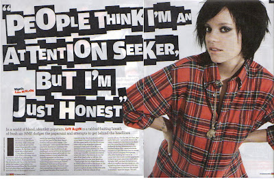
- The main image on this page is that of the famous British music artist Lily Allen
- Allen wears casual attire: the article is about the writer visiting her home.
- The title could be a floating quote that is taken from the article. The article is longer than 2 pages.
- From the title, we can tell that Lily Allen is a very straight forward person as she states her opinion: "People think I'm an attention seeker, but I'm just honest" sounds very personal and powerful, it sounds like something from a conversation. The tone is direct.
- The main article uses colloquialism by using words like "fucking" and "hootenanny".
- The word "fucking" is used twice in the article which gives the word emphasis and perhaps expresses the feelings of the article writer: swear words are often used in times of frustration and anger.
- The article also uses intertextuality three times: once when it refers to a '70s BBC comedy program, "Some Mothers Do 'Ave 'Em ", the second time when Allen's album, "It's Not Me, It's You " and a mention of another album, "Alright, Still ". Intertextuality could be used to catch the reader's attention.
- A drop cap is used: this is a very common convention of double page articles/spread and is used in most if not all double page spreads.
- Other conventions are seen like the pull quote that has been taken from the other unseen half of the article. Page numbers can be seen at the bottom along with the magazine name (NME) and the issue date of the magazine
- Credit has been given to the person who created the idea of making the title look like letters cut out from a newspaper.
- The style of the title suggests that perhaps Allen has something to hide or that she lives behind a mask: newspaper cut out words are often associated ransom notes which masks the identity of criminals when handwritten notes can easily identify criminals. Allen is portrayed as a criminal.
- The colours used correspond to the clothes that Allen uses as well as the magazines colours: red, black and white.
- Allen looks like she consumes the whole page and the title does the same, leaving little space for the main text.
- This article is a personal account of the writer, as they visit Allen's home
- Allen is represented as a stereotypical young person. We can see this by the hairstyle. However she is not represented as a stereotypical woman. She wears a shirt instead of a t-shirt or a skirt.
- Allen's pose makes it look like she is listening in on a conversation. Perhaps she is suggesting that the readers should also read carefully.
- Allen is used both on the front cover and this double page spread. She is this issue's focus.
- The main text is laid out in columns, giving it a newspaper appeal. It could suggest that this article is important as the newspaper appeal makes it seem like important news.
- The spread uses a direct mode of address: the tone is direct and Allen is looking directly at the reader (direct mode of address)
- This article is probably aimed at younger people. You can tell this by the clothes Allen wears, the newspaper cut out font used as the title and the colloquialisms used in the article. But the newspaper appeal makes it seem like it is aimed for older people. Perhaps the target audience is late teens to late 20 year olds.

No comments:
Post a Comment